Small space inspiration: navy bedroom & a statement ceiling for our alcove bed
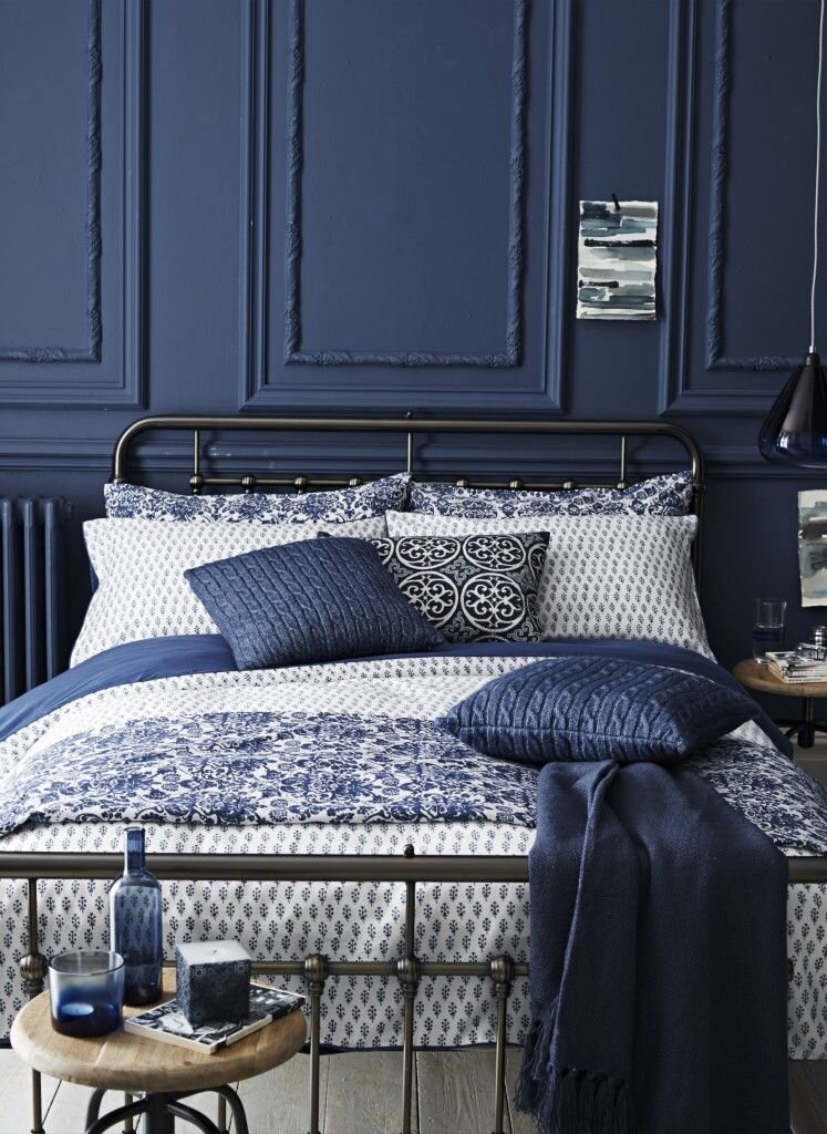
Introducing my new series on interior inspiration just for small space design lovers! For the first installment, I’m sharing our plans for a moody makeover of our RV bedroom. We'll be turning it into a fairytale alcove bed with navy walls and a statement ceiling. Dark bedrooms can be intimidating, so I wanted to walk you through the What and Why of renovating a bold bedroom.
cc left to right: my own | amara.com | Piccolomini Library floors by jehane on flikr | Scrovegni Chapel ceiling by Viaggio nel blu| scenicwallpaper.com | hm home
I’ve been wanting to experiment with a navy bedroom for nearly 5 years now. Why so long? Well, a move was always on the horizon—3 moves actually, including the big one abroad—so I painstakingly did the adult thing and waited. But it’s finally time to indulge that daydream. We’ll be making over our RV bedroom, which is really just an over cab bed, into a fairytale nook fit for a castle. (A Moorish-style castle that is…keep reading!) I know painting your bedroom a dark color can be quite intimidating for some, especially in small spaces. So I wanted to walk you through my decor inspiration and reasons for going bold.
Painting our small space a dark color is a functional decision
You can see the “BEFORE” of the alcove bed in our Youtube RV reno tour
True, I’m a total romantic and it shows in the way I design. But when advocating for tiny living, I always emphasize function above all else. So here’s the hidden logic behind going dark for our alcove bed: I’m a crap sleeper and I need all the help I can get. After doing some research, I’ve discovered the importance of minimizing light exposure to help you fall—and stay—asleep. I don’t just mean screens in your face before bed, but UV rays on your skin too. Painting our bedroom a dark color will help absorb light and create a space that feels safe to rest and encourages deep sleep.
In general, dark paint is such a versatile design tool. Inky walls can make an expansive space feel cozier and, when used in small space design, can help walls visually recede in a way that makes the room feel bigger. The latter is especially handy when two adults are sharing a teeny over cab bed and one of them is prone to claustrophobic panic attacks. (Yup, it’s me.) We’ll also be color-matching the bedspread and the curtain that divides the cab from the living space. Going monochromatic will help it feel like a dedicated room and reduce visual noise within the tight space.
Playing with pattern will also help make the space feel bigger
It’s not just going to be a solid navy color. You may think I’m nuts for suggesting a statement ceiling in a <4 foot crawl space, but stick with me here... Using depth of color, large shapes, or long lines can play tricks on the eye, helping to distort the perception of space and in our case help make it feel bigger. We can’t take ourselves too seriously—I mean we live in a van—so we’re going to lean into it. Adding pattern is so whimsical and layering patterns will add to the country home vibe we’ve gone for in our RV. The challenge is finding a motif that will add interest and depth without feeling oppressive.
The obvious place to start was to seek out wallpaper options but, given the low ceiling, the walls get banged up. You dirty minds! I mean from climbing in and out or making the bed. Wallpaper wouldn’t stand up to the wear and tear or exposure to the elements you get in an RV, so I couldn’t justify spending hundreds of dollars. I felt stuck for what to do next, so instead, we took a breather from renovating and hit the road over the holidays.
We’re looking to history and nature for specific inspiration
We weren’t sure what style to choose until we saw this Moorish-inspired palace. It snuck up on us while we were traveling! We’d stopped to see the Casa de Pilatos in Seville, a 15th-century palace built for the Dukes of Medinaceli. Parts of it were inspired by Arabic design and lavish in detail. But what I loved most was the indoor-outdoor feel—very relatable for van lifers like us. The inclusion of nature also helped make the overload of ornate decoration feel less pretentious. But there was one room in particular that stopped us in our tracks. We both looked up at this statement ceiling and then at each other, thinking, “that’s it!”
My photo of the Pilate’s Cabinet room in Casa de Pilatos in Seville, Spain
A navy ceiling with a variety of deep, medium, and light blue hues was dotted with shimmering-gold, star-like shapes. It’s historical relevance to the country we call home is meaningful to me and its likeness to the night sky feels hyper-relevant to the lifestyle we’ve just adopted. We loved the idea of reinterpreting the striking pattern for our own space. Simplifying the intricacy a bit will help it fit nicely with the other patterns we already have in the space and will add depth to the ceiling without it feeling “in your face”.
In the end, infusing our personal story is what makes our home singular and special
Fast forward to the post-holiday blues and I’m itching to get back into our RV renovation. I’ve started to pull together more examples of the style we’re hoping to capture in our so-called celestial ceiling. I’ve even seen some people refer to this look as “modern day mystic”. How cool? You choose whichever label you prefer, but I’m calling it my Velvet Sky.
cc @nomadbeautiful
You know that time of day—just after dusk—when the night sky turns a shade of navy that feels like if you reached out and touched it, it’d be made of velvet? That’s why I call it my Velvet Sky. It’s one of my favorite everyday, magical moments. Maybe because it’s usually when I’d be heading out to meet friends for a drink or strolling with my Love to dinner, but it’s an utterly romantic time of day for me. At least at this stage in my life. It reminds me so much of falling in love with Chris and I love the idea of capturing that essence, especially in our bedroom. It’s just kinda sexy too, no?
In the end, part of the fun of working with small spaces is how they force us to be super intentional and subsequently end up packed with thought and meaning. Like many folks, home wasn’t always a comfortable place growing up or as a young adult, so now that I’m homemaking for my own little family, I love to spend the extra time making it utterly ours.
So what do you think, would you be crazy enough to try this in your caravan or tiny home?
Update: check out the final over cab bed remodel on YouTube
How to find interior inspiration for your small space without being so literal
Often times when people are looking for decor inspiration they head to Pinterest, or leaf through magazines, looking for something that already exists, so they can replicate it. But being so literal in looking for interior design inspiration can be really limiting and, frankly, frustrating. I share my approach, or ‘secret sauce’, to designing a space that’s a perfect blend of my worldly style and need for function.
moodboard via homes to love au
Often times when people are looking for inspiration for decorating a room they head to Pinterest, or leaf through magazines, looking for something that already exists, so they can replicate it. But being so literal in looking for interior design inspiration can be really limiting and, frankly, frustrating. Why? Well, because every person or family will use a space differently. Our needs differ greatly depending on stage of life, available budget, the size of your home, personal style, and on and on. It’s part of what makes my work special and a rewarding challenge.
Because of this, I’ve come up with a sort of science to how I approach seeking interior inspiration and then applying that inspiration to a room. I’m going to walk you through my secret sauce today, so you can get unstuck in a current project or have more fun with your next room. (If at the end of this, you’d just rather I handle it, get in touch! I do in-person designing in Barcelona or digital consultations globally.)
Be clear about what you need from the space and identify any non-negotiables before you get carried away with the fun parts
Before designing a space, I like to come at the project from 2 angles: function and feel. Function defines how the space will be used and makes sure it “just works” without effort. Feel, is more about personal style and using aesthetics to capture a family’s essence and values in tangible form.
crop of Robert Lefèvre painting
Thinking through the function of your room, first and in detail, helps you identify the must-haves or prerequisites that are unique to you and your project. It’s important to emphasize that these are the things you can’t go back and solve easily if you realize them late. It doesn’t matter how pretty a room is if it adds to the friction in your life, instead of relieving it.
Identifying what the room needs to do—before what it could look like—gives you a list of concrete things you need to accommodate. Do you have a friend that will need wheelchair access, or out-of-town family that will visit a few times a year, or weight restrictions because your home is on wheels? Use this as the starting point for choosing the layout of the space, picking beautiful and functional furniture, and even weaving these unique attributes into the decorative details.
Once you have these in mind (and preferably written down), we can get down to finding inspiration for your ideal small space design. Here’s how I do it…
It’s not about finding a singular interior design style you like, it’s about identifying the details you’re attracted to—irrespective of its label
Let me give you an example: Say you want to redo your dining room. And you know you like the character of grand French chateau salons, but you’ve got a litter of young kids and pets, so your space has to accommodate them. Maybe you also kinda like the casual vibes of country cottages—but you could leave the doilies. So you try to find an example that already merges those 2 worlds: *types ‘classical french meets casual cottage dining room’ into Pinterest.*
That is awfully specific! Trust me, I’ve tried lol. And even if some examples already do exist, you’re limiting yourself by narrowing your avenues of inspiration. Instead, what I like to do is search all the various styles I’d like to encompass, in their original form. So in this example:
1) french chateau
chateau de la ballue via sharon santoni
2) family dining room
table via birchlane
3) and cozy cottage
via from britain with love
Then sift through the results and see what patterns you find. Maybe it’s the molding that you most gravitate towards in French interiors, you prefer dining rooms with statement pedestal tables, and like the muted color palette of country houses. This way, you understand the details that draw you to each distinct design style. Perfect! That gives some clear direction.
Now, before you move on to hunting down the perfect pieces, do 1 more thing. Answer: is there anything that’s universal across those 3 inspirations? Try not to think in concrete terms. Open your mind up to more subtle queues. Is there a mood or ambiance that they all trigger in you? Maybe it’s low-light or candlelight, or the sense of gathering together…
Jackpot. In addition to identifying specific architectural details and furniture you can incorporate, you’ve also set a north star that can guide you through decisions when you inevitably need to pick details or overcome restrictions (like budget) that you hadn’t yet solved at the onset of the project.
Bonus tip: if you have a clear design direction, but you get stuck, look for inspiration in other creative arts
sherpa jacket via upwest
boucle Miller chair via @trit.house
barcelona colors that inspired our RV design
kitchen decor from our RV renovation
Okay, I’m giving up one of my top tricks here. One way I stay inspired consistently is that I try to ‘sponge up’ the world around me. It can all be fodder for inspiration. I don’t just seek interior design inspiration from interiors or architecture. For example, I love the relationship between fashion and interiors. Did you know there’s a long history of them influencing one another? Indulge me for a second: have you seen those super-wide 18th-century hoop skirts (held up by panniers), well they influenced furniture design out of necessity. I mean, how cool!?
People also often credit nature. Instead of thinking literally about its influence—like cold weather = cozy cottage or seaside city = boho loft—look to its color combinations and the way texture adds to the feeling of a place. Try reinventing what we already take for granted. For example, when reimagining our RV into a tiny home on wheels, we merged the ideas of a country cottage with oceanfront vistas with old-world heritage.
More examples of cross-pollination between fashion, art, and interior design:
Dutch floral painting from Golden Age
TheGoodiesWallpapers via etsy
Dutch fashion designer Peet Dullaert
Cecil Hayes via AD
Look, I know designing a space to be functional and feel good can seem like a daunting task. But like anything else, it’s just a matter of starting somewhere and learning along the way. If you allow yourself to be playful—and inevitably come up with some awful combinations—you’ll eventually start to have a 6th sense, another creative language all your own. By flexing those problem solving and creative muscles, you strengthen them. If after a few attempts, you’d like a trainer to help you get there faster, I’m happy to help guide you. Just email me.
I’d love to see what experiments you come up with. Post your creations on Instagram and tag me @elisa_llera.


